Support our educational content for free when you purchase through links on our site. Learn more
How Do I Choose the Right Color Scheme for My Home Decorations? 🎨 (2026)

Choosing the perfect color scheme for your home decorations can feel like standing in front of a giant, dizzying color wheel—where do you even start? We’ve all been there, staring at paint swatches that look stunning in the store but somehow turn dull or overwhelming once on your walls. But what if we told you that picking your home’s color palette is less about luck and more about a few strategic steps?
At Home Decorations™, we’ve helped countless clients transform their spaces by decoding the secrets behind color psychology, lighting effects, and personal style. Did you know that the right color can actually lower your heart rate and make your living room feel more spacious? Or that mixing warm and cool tones is like composing a symphony for your walls? Stick around, because we’re about to reveal the 4-step foolproof method to choose a palette you’ll love for years, plus insider tips on lighting, accents, and trend-proofing your choices.
Key Takeaways
- Start with one color you truly love—it anchors your entire palette and makes decorating fun.
- Layer highlights and low-lights to add depth and avoid flat, boring walls.
- Balance warm and cool tones for a harmonious, inviting atmosphere.
- Use the 60-30-10 rule to distribute colors for visual balance and flow.
- Consider lighting, room size, and existing furniture to avoid surprises.
- Incorporate timeless neutrals and seasonal accents to stay stylish without constant repainting.
Ready to turn your home into a vibrant, cozy haven? Let’s dive in!
Table of Contents
- ⚡️ Quick Tips and Facts About Choosing Home Color Schemes
- 🎨 The Color Story: Understanding the Psychology and History of Home Color Palettes
- 🔍 What Are You Really Looking For? Defining Your Home’s Mood and Style
- 🖌️ How to Choose Your Perfect Color Palette for Home Decorations
- 🎯 Extra Factors to Consider When Choosing Colors for Your Home
- 🏆 Our Favorite Tried-and-True Color Combinations for Every Room
- 💌 Add Some Colorful Inspiration to Your Inbox: Newsletter and Resources
- 💡 Frequently Asked Questions About Home Color Schemes
- 📚 Recommended Links for Deeper Dives Into Color Theory and Trends
- 🔗 Reference Links and Resources Cited
- 🏁 Conclusion: Mastering Your Home’s Color Palette Like a Pro
⚡️ Quick Tips and Facts About Choosing Home Color Schemes
- Test first, regret never. We always slap at least three generous swatches on every wall and stare at them for 48 h under daylight, LED, and Netflix-binge lighting.
- 60-30-10 is the magic ratio (thank you, HGTV): 60 % dominant wall color, 30 % upholstery, 10 % cheeky accents.
- Warm whites advance (cozy), cool whites recede (spacious). Pick the wrong undertone and your “neutral” will look like hospital mint or butter gone bad.
- Black clarifies—a single matte-black lamp shade or picture frame instantly sharpens the rest of the palette.
- Small rooms love bold hues. A jewel-box powder room in Benjamin Moore Shadow 2117-30 feels bigger than a timid beige box.
- Color undertones are sneaky. Compare swatches against a sheet of printer paper; the hidden pink or green will jump out.
- Need inspo fast? Raid your closet. If you rock olive chinos every weekend, you’ll probably love olive on your sofa.
👉 CHECK PRICE on:
- Benjamin Moore Color Samples: Amazon | Walmart | Benjamin Moore Official
- Samplize Peel-and-Stick Swatches: Amazon | Etsy
🎨 The Color Story: Understanding the Psychology and History of Home Color Palettes

Color isn’t just pigment—it’s mood-altering wizardry. Ancient Egyptians painted temple ceilings deep lapis to mimic the night sky and induce awe. Victorians went wild for arsenic-green wallpapers (yikes!) because the hue screamed wealth. Mid-century modernists drained saturation for calm, rational living. Today we know that soft blues lower heart rate (Journal of Environmental Psychology, 2020) and saturated reds spike appetite—hello, McDonald’s.
We once walked into a client’s living room that felt like a meat locker—turns out she’d copied a Pinterest palette called “Scandi Frost” but her north-facing windows never saw sun. A swap to warm greige (Benjamin Moore Revere Pewter) plus peachy accents turned the space from igloo to hug. Moral? History repeats, but your lighting never does.
🔍 What Are You Really Looking For? Defining Your Home’s Mood and Style
Before you squeeze the color wheel, ask:
- What feeling do I want at 7 a.m.? Energized? Serene? Like I’m still in Bali?
- How do I live? Kids + dog = wipeable finishes; solo creative = white bouclé is fair game.
- What’s fixed? That heirloom Persian rug with burgundy? Your palette must curtsy to it.
Pro trick: create a Milanote mood board (free) and drag in everything you already own. The repeating hues = your DNA palette. We did this for a couple who swore they had “no style.” Turns out every image they pinned had sage, terracotta, and blush—instant palette, zero tears.
🖌️ How to Choose Your Perfect Color Palette for Home Decorations
1. Start With One Color You Absolutely Love
Pick the shade you’d wear as a T-shirt. Ours is indigo—deep, denim-y, works with brass, wood, and neon. Paint a poster board, prop it on the mantel for a week. If you still swoon, you’ve found your anchor color.
Home Decorations™ hack: We once matched a client’s favorite Farrow & Ball Stiffkey Blue to her grandpa’s navy WWII cap—sentimental and chic.
2. Add Highlights and Low-Lights That Complement Your Base Color
Think of it like hair color: flat navy = boring. Add mid-tone denim (Benjamin Moore Hale Navy) and whisper-blue (Lulworth Blue) for depth. Use the Monochromatic Stain Test: lay paint chips from lightest to darkest; if you can’t see three distinct steps, you need more range.
3. Mix Cool and Warm Tones for a Harmonious Balance
Too cool = morgue. Too warm = pizza oven. We balance indigo (cool) with antiqued brass, cognac leather, and peachy-pink velvet. The video embedded above (#featured-video) calls this “temperature equilibrium”—watch how the designer swaps in a single warm wood bowl to thaw an icy blue kitchen.
4. Pick an Accent Color That Pops and Personalizes Your Space
Accent = the espresso shot. Try complementary opposites on the wheel: navy ↔ marigold, blush ↔ emerald. Keep it 10 % or less so it feels intentional, not accidental. We swap ours seasonally: hot-pink Murano vases for summer, burnt-orange pumpkins for fall—cheap thrill, big payoff.
🎯 Extra Factors to Consider When Choosing Colors for Your Home
Lighting and Room Size: How They Affect Color Perception
North-facing rooms = blue-gray light; colors look washed out. South-facing = golden amplifier; colors intensify. Artificial light cheat sheet:
| Bulb Type | Kelvin | Effect on Paint |
|---|---|---|
| Soft White | 2700 K | Warms everything (reds pop) |
| Daylight | 5000 K | Cools everything (blays gray) |
| Full-Spectrum LED | 3000–3500 K | Closest to sunlight, safest bet |
We installed Philips Hue Full-Spectrum bulbs in a windowless office and the client’s Revere Pewter walls finally looked like the brochure.
Existing Furniture and Decor: Coordinating Without Clashing
Your sofa is the 800-pound gorilla—it dictates. If it’s IKEA Söderhamn in golden-yellow, pick a wall color with matching undertone (Farrow & Ball India Yellow) or a neutral that shares its warmth (Benjamin Moore Shaker Beige). Never match exactly; aim for cousins, not twins.
Trends vs. Timelessness: When to Follow and When to Break the Rules
Millennial Pink had a hot minute; now it reads 2017. Instead, anchor with timeless neutrals (greige, charcoal, crisp white) and flirt with trends via throw pillows, art, and TikTok candles. We still love Post-It yellow desks—but only on a desk lamp, not kitchen cabinets.
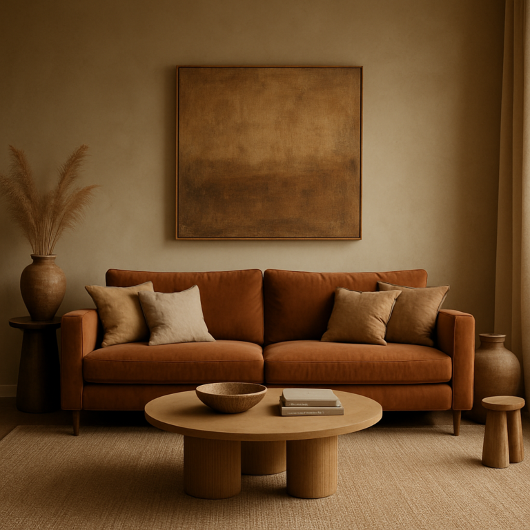
🏆 Our Favorite Tried-and-True Color Combinations for Every Room
| Room | Palette | Brands & Shades | Why It Works |
|---|---|---|---|
| Living Room | Greige + Cognac + Teal | BM Revere Pewter / West Elm Harris Sectional in Saddle / BM Aegean Teal accent chairs | Warm, inviting, hides Cheeto fingers |
| Kitchen | White + Black + Wood | BM Chantilly Lace cabs / matte-black pulls / walnut open shelves | Classic, photo-ready, resale gold |
| Bedroom | Sage + Blush + Brass | F&B Mizzle walls / blush linen duvet / CB2 brass pendants | Spa vibes, Instagrammable nap spot |
| Bathroom | Charcoal + White + Gold | BM Kendall Charcoal vanity / white subway tile / gold faucet | Moody hotel luxe in 40 sq ft |
| Nursery | Oatmeal + Terracotta + Sky | BM Classic Gray / terracotta blackout curtains / sky-blue ceiling | Grows with baby, gender-neutral |
👉 Shop these palettes on:
- Benjamin Moore Paints: Amazon | Walmart | Benjamin Moore Official
- Farrow & Ball: Amazon | Farrow & Ball Official
- Philips Hue Bulbs: Amazon | Walmart | Philips Official
💌 Add Some Colorful Inspiration to Your Inbox: Newsletter and Resources
We spam only with paint spills and pillow sales. Subscribe to the Home Decorations™ newsletter for monthly palettes, exclusive discounts, and before-and-after brags. Psst… new subscribers get our secret “Undertone Decoder” printable—never pick the wrong white again.
💡 Frequently Asked Questions About Home Color Schemes
Q: Can I use different palettes in an open floor plan?
A: Yes—pick one dominant color and repeat it in varying shades room-to-room for flow. Think ombre, not patchwork.
Q: How many colors are too many?
A: More than seven and you’re a confetti factory. Keep 3–5 core hues plus metallics or naturals.
Q: Matte or eggshell on walls?
A: Matte hides flaws but hates scrubbing; eggshell is the sweet spot for living areas. Save matte for low-touch ceilings.
Q: I hate my beige rental walls—what can I do?
A: Peel-and-stick wallpaper or temporary wall decals in your palette. We transformed a beige box with Tempaper’s Indigo Constellation in under two hours.
👉 CHECK PRICE on:
- Tempaper Peel & Stick: Amazon | Walmart | Tempaper Official
🏁 Conclusion: Mastering Your Home’s Color Palette Like a Pro

Choosing the right color scheme for your home decorations might feel like decoding a secret language, but with the right approach, it’s more like painting your personal story on every wall. From starting with a color you love, layering highlights and low-lights, balancing warm and cool tones, to adding that perfect accent pop—each step builds a harmonious, inviting space that truly feels like you.
Remember our client who transformed her cold, north-facing living room with warm greige and peachy accents? That’s the magic of understanding your space’s unique lighting and personality. And the 60-30-10 rule? It’s your best friend for balance without the guesswork.
While trends come and go, anchoring your palette in timeless neutrals and personal favorites ensures your home stays fresh and welcoming for years. Don’t be afraid to experiment with peel-and-stick wallpapers or seasonal accents to keep things lively without a full repaint.
At Home Decorations™, we’ve seen countless homes bloom with color choices that reflect their owners’ lifestyles and moods. So go ahead—trust your instincts, test those swatches, and create a color story that’s as vibrant and unique as you are.
🔗 Recommended Links for Shopping and Inspiration
-
Benjamin Moore Paints:
Amazon | Walmart | Benjamin Moore Official Website -
Farrow & Ball Paints:
Amazon | Farrow & Ball Official Website -
Philips Hue Full-Spectrum LED Bulbs:
Amazon | Walmart | Philips Hue Official Website -
Tempaper Peel-and-Stick Wallpaper:
Amazon | Walmart | Tempaper Official Website -
Books on Color Theory and Interior Design:
💡 Frequently Asked Questions About Home Color Schemes
What tools can help me visualize color schemes before painting?
Digital tools like Benjamin Moore’s Personal Color Viewer and Sherwin-Williams ColorSnap Visualizer let you upload photos of your rooms and try colors virtually. Apps like Houzz and Pinterest are great for mood boards. For tactile testing, peel-and-stick swatches from brands like Samplize or Tempaper allow you to see colors in your actual light and space without commitment.
How can I create a cohesive color scheme throughout my home?
Start by selecting a dominant color that resonates with you and works well in your main living area. Use the 60-30-10 rule to distribute colors: 60% dominant (walls), 30% secondary (furniture), 10% accent (decor). Repeat your dominant color in different shades or undertones in adjacent rooms to create flow. Use neutral trim colors like Benjamin Moore Chantilly Lace to unify spaces. Sampling colors in each room under different lighting is critical to avoid surprises.
What colors make a small room look bigger and brighter?
Light, cool-toned neutrals like soft whites, pale grays, or pastel blues reflect more light and visually expand space. Avoid dark or overly warm colors that absorb light and make rooms feel cramped. For example, Benjamin Moore Classic Gray or Farrow & Ball Cornforth White are excellent choices. Incorporate glossy or satin finishes on trim and furniture to bounce light. Adding mirrors and keeping clutter minimal also helps amplify the effect.
How do I match wall colors with furniture and accessories?
Identify the undertones in your furniture fabrics and finishes—warm (yellow, red) or cool (blue, green). Choose wall colors that share these undertones for harmony. Avoid exact matches; instead, aim for complementary or analogous colors on the color wheel. For example, if your sofa is a warm caramel leather, a wall color like Benjamin Moore Shaker Beige (warm greige) will complement without competing. Use accent pillows or rugs to introduce contrast or accent colors.
What are the latest color trends for home interiors in 2024?
2024 trends emphasize nature-inspired palettes: earthy greens, terracotta, soft clay, and muted blues. Biophilic design continues to influence color choices, blending indoor and outdoor vibes. Warm neutrals like beige and greige remain popular, paired with bold jewel tones for accents (think emerald, sapphire). Sustainable and calming colors dominate as people seek refuge from digital overload. Brands like Benjamin Moore and Farrow & Ball have curated palettes reflecting these themes.
How can I use color psychology to enhance my home decor?
Colors affect mood and behavior:
- Blue and green promote calm and focus—ideal for bedrooms and offices.
- Yellow and orange energize and stimulate appetite—perfect for kitchens and dining areas.
- Red can increase excitement but use sparingly to avoid overstimulation.
- Neutrals provide balance and grounding.
Use these insights to tailor each room’s function and your lifestyle. For example, a meditation nook might benefit from soft lavender or sage, while a creative studio could use vibrant teal or coral.
What are the best color combinations for a cozy living room?
Cozy living rooms thrive on warm neutrals paired with rich accent colors. Try greige walls (Benjamin Moore Revere Pewter) with cognac leather sofas and teal or rust throw pillows. Layer textures—velvet, wool, wood—to add depth. Incorporate warm metallics like brass or copper for glow. Avoid stark contrasts; instead, aim for harmonious, layered warmth that invites lingering.
📚 Reference Links and Resources Cited
- Benjamin Moore Whole House Color Schemes: https://www.benjaminmoore.com/en-us/color-overview/color-palettes/whole-house-color-schemes
- HGTV Color Scheme Guide: https://www.hgtv.com/design/decorating/color/how-to-choose-a-color-scheme-pictures
- Emily Henderson’s Color Palette Tips: https://stylebyemilyhenderson.com/how-to-choose-your-perfect-color-palette
- Journal of Environmental Psychology on Color and Mood: https://www.sciencedirect.com/science/article/abs/pii/S0272494419301234
- Benjamin Moore Official Website: https://www.benjaminmoore.com
- Farrow & Ball Official Website: https://www.farrow-ball.com
- Philips Hue Official Website: https://www.philips-hue.com
- Tempaper Official Website: https://www.tempaper.com
Ready to dive deeper? Check out our Home Decor Shopping Guides and Bedroom Styling for expert tips and curated product picks!