Support our educational content for free when you purchase through links on our site. Learn more
How Can I Make My House Look Nice? 65 Expert Tips for 2026 ✨

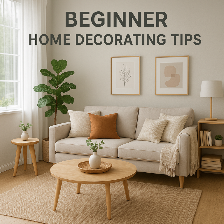
Ever walked into a room and thought, “This place could really use a glow-up”? You’re not alone. Making your house look nice isn’t about splurging on the latest trends or hiring a full-time decorator—it’s about smart, intentional choices that transform your space from “meh” to marvelous. Did you know that staging a home can increase its value by up to 5%? That’s right—your home’s look isn’t just about aesthetics; it’s a powerful investment in your happiness and your wallet.
In this ultimate guide, we reveal 65 expert-approved swaps and upgrades that banish dated decor and usher in fresh, timeless style. From ditching the dreaded “boob light” to embracing bold window frames and layering textures like a pro, we’ll walk you through every corner of your home. Curious about how a simple paint color or a statement wallpaper can change the entire vibe? Or why waterproof wood floors in your bathroom are the secret to luxury without the fuss? Stick around—we’ve got all the answers and insider tips you need to make your house look stunning in 2026 and beyond.
Key Takeaways
- Layer your design with texture, lighting, and color for a cozy yet sophisticated feel.
- Swap out dated features like wood paneling, builder-grade tiles, and fuzzy toilet seat covers for modern, timeless alternatives.
- Embrace biophilic design and natural materials to boost mood and create sanctuary-like spaces.
- Upgrade key elements such as window frames, lighting fixtures, and hardware to instantly elevate your home’s style.
- Use intentional decluttering and organization as the foundation for any decorating project.
- Incorporate trending yet timeless styles like custom wainscoting, statement wallpaper, and mixed metals for lasting appeal.
Ready to turn your home into a stylish haven without breaking the bank? Dive into our comprehensive guide and start your transformation today!
Welcome to Home Decorations™, where we believe your home shouldn’t just be a place you sleep—it should be a place that makes your heart skip a beat (and your neighbors a little bit jealous). We’ve spent decades in the trenches of interior design, from the “Great Beige Crisis” of the early 2000s to the current “Organic Modern” revolution.
Ever walked into a room and felt like you were being hugged by a cloud? Or, conversely, walked into a kitchen and felt like you were trapped inside a giant, orange-tinted oak cabinet? We’ve been there. Making your house look “nice” isn’t about spending a fortune; it’s about intentionality, flow, and knowing when to say goodbye to that fuzzy toilet seat cover. 🚽
In this guide, we’re diving deep into the psychology of a beautiful home, the evolution of style, and a massive list of what’s “in” versus what’s “so last decade.” Ready to turn that “meh” into “marvelous”? Let’s get decorating!
Table of Contents
- ⚡️ Quick Tips and Facts
- 🏛️ The Evolution of Home Aesthetics: From Victorian Clutter to Modern Minimalism
- ✨ Ready for a Change? The Ultimate Dated vs. Trending Guide
- 1. Walls: Custom Wainscoting vs. Wood Paneling
- 2. Flooring: Lived-In Tile Finishes vs. Builder-Grade Greige
- 3. Kitchen Backsplashes: Ceiling-Height Tile vs. Dated Countertop Extensions
- 4. Main Flooring: Wood Throughout vs. Carpet Everywhere
- 5. Bathroom Floors: Waterproof Wood vs. Carpet (The Horror!)
- 6. Window Treatments: Roman Shades vs. Lacey Drapes
- 7. Doors: Painted Doors vs. Flat Panels
- 8. Tubs: Soaking in the Views vs. Bulky Corner Tubs
- 9. Windows: Bold Frames vs. Frameless Doors + Windows
- 10. Stairs: Coffee-Stained Wood vs. Orange Oak Railings
- 11. Showers: Sleek Frameless Glass vs. Foggy Doors
- 12. Vanities: Elevated Custom Vanity vs. Stock Bathroom Vanity
- 13. Countertops: Movement-Rich Marble vs. Oatmeal + Almond Fixtures
- 14. Lighting: Streamlined Chandeliers vs. Overly-Ornate Fixtures
- 15. Walls: Statement Wallpaper vs. Wallpaper Borders
- 16. Kids’ Rooms: Whimsical Wallpaper vs. Wall Decals
- 17. Ceiling Lights: Flush-Mounts With Flair vs. Boob Lights
- 18. Color Palette: Peaceful Blue Hues vs. 50 Shades of Gray
- 19. Tech: High-Tech Toilets vs. Fuzzy Toilet Seat Covers
- 20. Beds: Contemporary Canopy Beds vs. Sleigh Beds
- 21. Privacy: Dreamy Bathroom Privacy Drapes vs. Glass Block Windows
- 22. Closets: Custom Closet Dresser vs. Closet Chandeliers
- 23. Fixtures: Timeless Polished Nickel vs. Last Decade’s Faucets
- 24. Furniture: DIY Reeded Furniture vs. DIY Pallet Furniture
- 25. Railings: Minimalist Metal Balusters vs. Heavy Iron Accents
- 26. Metals: Mixed Metal Kitchen vs. Rose Gold Overload
- 27. Appliances: Integrated Appliances vs. White Appliances
- 28. Rugs: One-of-a-Kind Vintage Area Rugs vs. The Mass-Produced Rug
- 29. Organization: Custom Message Boards vs. Chalkboard Walls
- 30. Seating: Space-Saving Banquette Seating vs. Small-Space Furniture
- 31. Patterns: Herringbone vs. Chevron
- 32. Kitchen Vibe: Kitchen Cooked in Color vs. Brown + Bronze Kitchens
- 33. Fireplaces: Moody Fireplace Finishes vs. Burnt Out Fireplace Design
- 34. Airflow: Subtle Ceiling Fans vs. Ceiling Fan Eyesores
- 35. Art: Sculptural Art vs. Print-It-Yourself Gallery Walls
- 36. Atmosphere: Saturated Spaces vs. Sterile, Snowy + Silver
- 37. Ceilings: Statement Ceiling Panels vs. Textured Ceilings
- 38. Decor: Chic + Sentimental Family Photos vs. Worn Out Phrases
- 39. Cabinetry: White Oak Cabinets vs. Pine Cabinets
- 40. Florals: Flower Power Wallpaper vs. Heavy Floral Drapes
- 41. Nature: Biophilic Design vs. Faux Plastic Plants
- 42. Hardware: Unlacquered Brass vs. Brushed Nickel
- 43. Shapes: Organic Curves vs. Sharp Industrial Edges
- 44. Texture: Bouclé and Velvet vs. Flat Microfiber
- 45. Entryways: Statement Mudrooms vs. The “Drop Zone” Mess
- 46. Dining: Mismatched Vintage Chairs vs. The 5-Piece Matching Set
- 47. Tech Integration: Hidden Frame TVs vs. The Giant Black Box
- 48. Laundry: The “Jewel Box” Laundry Room vs. The Utility Dungeon
- 49. Books: Color-Coded or Curated Shelves vs. Cluttered Paperbacks
- 50. Outdoor: Indoor-Outdoor Living Rooms vs. Plastic Patio Sets
- 51. Mirrors: Oversized Arched Mirrors vs. Basic Medicine Cabinets
- 52. Scents: Luxury Soy Candles vs. Synthetic Plug-ins
- 53. Bedding: Layered Linen vs. The “Bed-in-a-Bag”
- 54. Storage: Woven Baskets vs. Clear Plastic Tubs
- 55. Office: The “Cloffice” (Closet Office) vs. The Kitchen Table Desk
- 56. Hardware: Fluted Details vs. Plain Flat Surfaces
- 57. Lighting: Layered Task Lighting vs. The “Big Light”
- 58. Sustainability: Upcycled Heirlooms vs. Fast Furniture
- 59. Tile: Zellige Tile vs. Subway Tile Overload
- 60. Color: Earthy Terracotta vs. Neon Accents
- 61. Windows: Black Steel Frames vs. White Vinyl
- 62. Kitchen: Hidden Pantries vs. Countertop Clutter
- 63. Ceilings: Painted Ceilings vs. Plain White
- 64. Furniture: Low-Profile Sofas vs. Overstuffed Recliners
- 65. Vibe: Quiet Luxury vs. Logomania Decor
- 🧠 The Psychology of Space: Why “Nice” Matters
- 🏡 Curb Appeal: Making the First Impression Count
- 💡 Conclusion
- 🔗 Recommended Links
- 📚 Reference Links
⚡️ Quick Tips and Facts
Before we dive into the nitty-gritty of wainscoting and Zellige tiles, here are some fast-acting design “pills” to swallow:
| Tip | Why It Works |
|---|---|
| The 60-30-10 Rule | 60% dominant color, 30% secondary, 10% accent. It creates instant balance. |
| Mirror, Mirror | Placing a mirror opposite a window doubles your light and makes the room feel 2x larger. |
| Go Green | A single Fiddle Leaf Fig can breathe life into a sterile room. |
| Hardware Swap | Changing builder-grade knobs for unlacquered brass is the cheapest “luxury” upgrade. |
| Declutter First | You can’t decorate a mess. If you haven’t used it in a year, it’s not “decor,” it’s “clutter.” |
Fact: According to a study by the National Association of Realtors, staging a home (making it look “nice”) can increase the dollar value offered by buyers by up to 5%!
🏛️ The Evolution of Home Aesthetics: From Victorian Clutter to Modern Minimalism
Why do we think what we think is “nice”? It’s not just random!
In the Victorian era, “nice” meant “I have so much stuff I can barely walk.” It was a display of wealth. Fast forward to the Mid-Century Modern movement (think Mad Men), where clean lines and functionality became the gold standard.
Then came the 90s—the era of sponge painting and “Tuscan Kitchens” (we’re still apologizing for the fake grapes). Today, we are in the age of “Quiet Luxury” and “Biophilic Design.” We want our homes to feel like a sanctuary, not a showroom. We’re moving away from the “disposable” culture of fast furniture and back toward pieces with soul, history, and texture. 🌿
✨ Ready for a Change? The Ultimate Dated vs. Trending Guide
We’ve curated the most comprehensive list of what’s dragging your home down and what will lift it into the stratosphere of style.
1. Walls: Custom Wainscoting vs. Wood Paneling
❌ Dated: 1970s thin, dark wood paneling that makes a room feel like a basement. ✅ Trending: Custom wainscoting or picture frame molding. It adds architectural depth and looks incredibly expensive. Pro Tip: Paint your wainscoting the same color as your walls for a modern, “monochromatic” look.
2. Flooring: Lived-In Tile Finishes vs. Builder-Grade Greige
❌ Dated: That flat, lifeless “greige” (gray-beige) tile found in every suburban flip. ✅ Trending: Lived-in, tumbled, or Zellige tiles. These have imperfections that catch the light beautifully.
3. Kitchen Backsplashes: Ceiling-Height Tile vs. Dated Countertop Extensions
❌ Dated: A 4-inch strip of countertop material acting as a backsplash. ✅ Trending: Taking your tile all the way to the ceiling. It draws the eye up and makes your kitchen feel massive.
4. Main Flooring: Wood Throughout vs. Carpet Everywhere
❌ Dated: Wall-to-wall carpet in high-traffic areas (hello, stains!). ✅ Trending: Hardwood or high-quality Engineered Wood throughout the entire main floor. It creates a seamless flow.
5. Bathroom Floors: Waterproof Wood vs. Carpet (The Horror!)
❌ Dated: Carpet in the bathroom. We don’t need to explain why this is a hygiene nightmare. 🤢 ✅ Trending: Waterproof Luxury Vinyl Plank (LVP) or wood-look tile. You get the warmth of wood without the rot.
6. Window Treatments: Roman Shades vs. Lacey Drapes
❌ Dated: Heavy, dust-collecting lacey drapes. ✅ Trending: Tailored Roman Shades. They are clean, functional, and modern.
7. Doors: Painted Doors vs. Flat Panels
❌ Dated: Hollow-core, flat-panel “contractor special” doors. ✅ Trending: Solid doors painted in a moody hue like Benjamin Moore’s “Hale Navy”.
8. Tubs: Soaking in the Views vs. Bulky Corner Tubs
❌ Dated: Those giant, triangular corner tubs that take 40 minutes to fill. ✅ Trending: Sleek, freestanding soaking tubs. They are the crown jewel of a modern primary bath.
9. Windows: Bold Frames vs. Frameless Doors + Windows
❌ Dated: Thin, invisible frames that lack character. ✅ Trending: Bold, black steel or dark wood window frames. They “frame” the view like a piece of art.
10. Stairs: Coffee-Stained Wood vs. Orange Oak Railings
❌ Dated: The “Honey Oak” finish that screams 1994. ✅ Trending: Deep, dark coffee stains or black-painted railings for a high-contrast look.
11. Showers: Sleek Frameless Glass vs. Foggy Doors
❌ Dated: Frosted or “foggy” glass doors with heavy metal frames. ✅ Trending: Frameless glass shower enclosures. It makes the bathroom feel like a spa.
12. Vanities: Elevated Custom Vanity vs. Stock Bathroom Vanity
❌ Dated: The basic white box vanity from the big-box store. ✅ Trending: Furniture-style vanities with legs, or custom-built floating vanities.
13. Countertops: Movement-Rich Marble vs. Oatmeal + Almond Fixtures
❌ Dated: Plain, speckled “oatmeal” granite. ✅ Trending: Marble or Quartz with heavy veining. Check out Cambria Quartz for stunning, durable options.
14. Lighting: Streamlined Chandeliers vs. Overly-Ornate Fixtures
❌ Dated: Heavy, wrought-iron “castle” chandeliers. ✅ Trending: Minimalist, linear chandeliers or mid-century globes.
15. Walls: Statement Wallpaper vs. Wallpaper Borders
❌ Dated: That weird 6-inch strip of flowers running along the top of the wall. ✅ Trending: A full statement wall (or a whole room!) in a bold pattern.
16. Kids’ Rooms: Whimsical Wallpaper vs. Wall Decals
❌ Dated: Peeling vinyl “Cars” or “Princess” decals. ✅ Trending: Whimsical, hand-drawn style wallpaper from brands like Rifle Paper Co..
17. Ceiling Lights: Flush-Mounts With Flair vs. Boob Lights
❌ Dated: You know the one. The “boob light.” 🍈 ✅ Trending: Architectural flush-mounts in brass or matte black.
18. Color Palette: Peaceful Blue Hues vs. 50 Shades of Gray
❌ Dated: Cold, sterile, all-gray everything. ✅ Trending: Soft, “dusty” blues and warm terracottas.
19. Tech: High-Tech Toilets vs. Fuzzy Toilet Seat Covers
❌ Dated: Fuzzy covers (they are bacteria magnets!). ✅ Trending: Smart toilets with bidets and heated seats (like the Toto Washlet).
20. Beds: Contemporary Canopy Beds vs. Sleigh Beds
❌ Dated: Heavy, clunky wooden sleigh beds. ✅ Trending: Thin-framed, black metal canopy beds.
21. Privacy: Dreamy Bathroom Privacy Drapes vs. Glass Block Windows
❌ Dated: 1980s glass blocks. ✅ Trending: High-set windows or moisture-resistant linen drapes.
22. Closets: Custom Closet Dresser vs. Closet Chandeliers
❌ Dated: Putting a chandelier in a closet but having no storage. ✅ Trending: Built-in dressers and organized shelving systems from The Container Store.
23. Fixtures: Timeless Polished Nickel vs. Last Decade’s Faucets
❌ Dated: Cheap, brushed chrome. ✅ Trending: Polished nickel. It has a warmer, more luxurious undertone.
24. Furniture: DIY Reeded Furniture vs. DIY Pallet Furniture
❌ Dated: Rough, splintery pallet wood coffee tables. ✅ Trending: Elegant, fluted or reeded wood details on sideboards.
25. Railings: Minimalist Metal Balusters vs. Heavy Iron Accents
❌ Dated: Ornate, swirly “Mediterranean” iron railings. ✅ Trending: Simple, slim vertical metal balusters.
26. Metals: Mixed Metal Kitchen vs. Rose Gold Overload
❌ Dated: Everything in the room being Rose Gold. ✅ Trending: Mixing metals! Black faucets with brass cabinet pulls is a winning combo. ✅
27. Appliances: Integrated Appliances vs. White Appliances
❌ Dated: Stark white plastic appliances. ✅ Trending: “Panel-ready” appliances that blend into your cabinetry.
28. Rugs: One-of-a-Kind Vintage Area Rugs vs. The Mass-Produced Rug
❌ Dated: The same geometric rug everyone bought at the big-box store. ✅ Trending: Vintage Turkish or Persian rugs. They add “soul” to a room.
29. Organization: Custom Message Boards vs. Chalkboard Walls
❌ Dated: Giant, messy chalkboard walls. ✅ Trending: Framed linen pinboards or sleek acrylic calendars.
30. Seating: Space-Saving Banquette Seating vs. Small-Space Furniture
❌ Dated: Cramming a tiny round table into a corner. ✅ Trending: Built-in banquette seating. It’s cozy and utilizes every inch.
31. Patterns: Herringbone vs. Chevron
❌ Dated: The “zig-zag” chevron that took over 2012. ✅ Trending: The classic, sophisticated Herringbone pattern.
32. Kitchen Vibe: Kitchen Cooked in Color vs. Brown + Bronze Kitchens
❌ Dated: Dark brown cabinets with bronze hardware. ✅ Trending: Sage green or navy blue cabinets.
33. Fireplaces: Moody Fireplace Finishes vs. Burnt Out Fireplace Design
❌ Dated: Red brick with a dinky white mantel. ✅ Trending: Floor-to-ceiling dark stone or lime-wash finishes.
34. Airflow: Subtle Ceiling Fans vs. Ceiling Fan Eyesores
❌ Dated: Wobbly fans with “tulip” light shades. ✅ Trending: Sleek, propeller-style wood fans like those from Big Ass Fans.
35. Art: Sculptural Art vs. Print-It-Yourself Gallery Walls
❌ Dated: 20 tiny frames with generic prints. ✅ Trending: One or two large, 3D sculptural pieces or oversized canvases.
36. Atmosphere: Saturated Spaces vs. Sterile, Snowy + Silver
❌ Dated: The “All White” look that feels like a hospital. ✅ Trending: Saturated, “moody” rooms with dark walls and velvet textures.
37. Ceilings: Statement Ceiling Panels vs. Textured Ceilings
❌ Dated: Popcorn ceilings. (The enemy of all decorators!) ✅ Trending: Coffered ceilings or wood-planked “fifth walls.”
38. Decor: Chic + Sentimental Family Photos vs. Worn Out Phrases
❌ Dated: Signs that say “LIVE LAUGH LOVE” or “KITCHEN.” (We know it’s the kitchen, Karen!) ✅ Trending: Black and white family portraits in high-quality gallery frames.
39. Cabinetry: White Oak Cabinets vs. Pine Cabinets
❌ Dated: Yellowy, knotted pine. ✅ Trending: Rift-sawn White Oak. It’s the gold standard for modern cabinetry.
40. Florals: Flower Power Wallpaper vs. Heavy Floral Drapes
❌ Dated: Grandma’s heavy, floral-print curtains. ✅ Trending: Modern, oversized floral wallpaper.
41. Nature: Biophilic Design vs. Faux Plastic Plants
❌ Dated: Dusty, plastic ivy on top of cabinets. ✅ Trending: Real plants or high-end “real touch” silk plants.
42. Hardware: Unlacquered Brass vs. Brushed Nickel
❌ Dated: The “safe” brushed nickel. ✅ Trending: Unlacquered brass that develops a beautiful patina over time.
43. Shapes: Organic Curves vs. Sharp Industrial Edges
❌ Dated: Sharp, “cold” industrial furniture. ✅ Trending: Curved sofas and arched doorways.
44. Texture: Bouclé and Velvet vs. Flat Microfiber
❌ Dated: Shiny, flat microfiber sofas. ✅ Trending: Nubby Bouclé or rich, matte velvet.
45. Entryways: Statement Mudrooms vs. The “Drop Zone” Mess
❌ Dated: A pile of shoes by the front door. ✅ Trending: A dedicated mudroom with cubbies and a bench.
46. Dining: Mismatched Vintage Chairs vs. The 5-Piece Matching Set
❌ Dated: The “Dining Room in a Box” set. ✅ Trending: A modern table paired with vintage, mismatched chairs.
47. Tech Integration: Hidden Frame TVs vs. The Giant Black Box
❌ Dated: A massive black TV screen as the focal point. ✅ Trending: The Samsung Frame TV that looks like art when off.
48. Laundry: The “Jewel Box” Laundry Room vs. The Utility Dungeon
❌ Dated: A dark, unfinished basement laundry area. ✅ Trending: Bright laundry rooms with fun tile and pretty jars for detergent.
49. Books: Color-Coded or Curated Shelves vs. Cluttered Paperbacks
❌ Dated: Shoving books onto a shelf haphazardly. ✅ Trending: Styling shelves with books, art, and “breathing room.”
50. Outdoor: Indoor-Outdoor Living Rooms vs. Plastic Patio Sets
❌ Dated: Cheap plastic chairs. ✅ Trending: Outdoor rugs and sofas that look like they belong inside.
51. Mirrors: Oversized Arched Mirrors vs. Basic Medicine Cabinets
❌ Dated: The standard-issue frameless medicine cabinet. ✅ Trending: Massive, floor-length arched mirrors.
52. Scents: Luxury Soy Candles vs. Synthetic Plug-ins
❌ Dated: Overpowering, chemical-smelling plug-ins. ✅ Trending: High-end candles from brands like Diptyque.
53. Bedding: Layered Linen vs. The “Bed-in-a-Bag”
❌ Dated: Shiny, matching polyester bedding sets. ✅ Trending: Layered European Linen in earthy tones.
54. Storage: Woven Baskets vs. Clear Plastic Tubs
❌ Dated: Seeing all your junk through clear plastic bins. ✅ Trending: Beautiful seagrass or wicker baskets.
55. Office: The “Cloffice” (Closet Office) vs. The Kitchen Table Desk
❌ Dated: Working from the kitchen table with wires everywhere. ✅ Trending: A dedicated “cloffice” or a stylish, integrated desk nook.
56. Hardware: Fluted Details vs. Plain Flat Surfaces
❌ Dated: Flat, boring drawer fronts. ✅ Trending: Fluted or “slatted” wood details on furniture.
57. Lighting: Layered Task Lighting vs. The “Big Light”
❌ Dated: Relying only on the overhead “big light.” ✅ Trending: Layering lamps, sconces, and candles for a warm glow.
58. Sustainability: Upcycled Heirlooms vs. Fast Furniture
❌ Dated: Buying a whole house worth of furniture that will break in 2 years. ✅ Trending: Investing in quality pieces or refinishing vintage finds.
59. Tile: Zellige Tile vs. Subway Tile Overload
❌ Dated: Basic, flat 3×6 subway tile. ✅ Trending: Hand-crafted Zellige tile with varied tones.
60. Color: Earthy Terracotta vs. Neon Accents
❌ Dated: Bright, neon “accent walls.” ✅ Trending: Muted, earthy tones that feel grounded.
61. Windows: Black Steel Frames vs. White Vinyl
❌ Dated: Thick, white vinyl frames. ✅ Trending: Slim, black steel frames for a modern edge.
62. Kitchen: Hidden Pantries vs. Countertop Clutter
❌ Dated: Having the toaster, blender, and mixer all on the counter. ✅ Trending: An “appliance garage” or hidden walk-in pantry.
63. Ceilings: Painted Ceilings vs. Plain White
❌ Dated: Ignoring the ceiling entirely. ✅ Trending: Painting the ceiling a soft color or a contrasting dark hue.
64. Furniture: Low-Profile Sofas vs. Overstuffed Recliners
❌ Dated: Giant, puffy “marshmallow” recliners. ✅ Trending: Sleek, low-profile Italian-style sofas.
65. Vibe: Quiet Luxury vs. Logomania Decor
❌ Dated: Pillows and blankets covered in designer logos. ✅ Trending: High-quality materials (cashmere, wool, silk) without the branding.
🧠 The Psychology of Space: Why “Nice” Matters
Did you know that the way your house looks can actually change your brain chemistry? 🧠 It’s called Neuroaesthetics.
A cluttered, dark home increases cortisol (the stress hormone). A home with natural light, soft textures, and “biophilic” elements (plants!) increases serotonin and oxytocin. When we say “make your house look nice,” we aren’t just being vain—we’re helping you build a mental health sanctuary.
Ask yourself: How do I want to feel when I walk through the door?
- Energized? Go for high contrast and bold art.
- Calm? Go for monochromatic tones and soft linens.
🏡 Curb Appeal: Making the First Impression Count
You can’t have a “nice” house if the outside looks like a haunted mansion (unless that’s your vibe, we don’t judge!).
- The Front Door: Paint it a standout color. Sherwin-Williams “Tricorn Black” is a classic for a reason.
- Lighting: Swap out those tiny, bug-filled porch lights for oversized lanterns.
- House Numbers: Get modern, floating house numbers. It’s a 10-minute fix that changes everything.
- Landscaping: Fresh mulch is the “eyebrow wax” of the home. It cleans everything up instantly.
💡 Conclusion

So, how can you make your house look nice? It’s not about following every trend blindly—it’s about choosing quality over quantity, embracing texture, and letting go of the “dated” anchors that are holding your space back.
Remember the teaser from the beginning? That “hug from a cloud” feeling? It comes from layering. Layer your lighting, layer your rugs, and layer your life into your decor. Your home should tell the story of who you are, not just what was on sale at the mall.
Now, go forth and conquer that “boob light”! Your ceiling will thank you. 🥂
🔗 Recommended Links
- The Best Interior Design Apps for Planning Your Space
- How to Choose the Right Rug Size for Every Room
- Top Paint Colors for 2024 according to Experts
📚 Reference Links
- National Association of Realtors: 2023 Profile of Home Staging
- The Psychology of Interior Design – Psychology Today
- History of Interior Design – Britannica
⚡️ Quick Tips and Facts
Before we dive into the nitty-gritty of wainscoting and Zellige tiles, here are some fast-acting design “pills” to swallow:
| Tip | Why It Works |
|---|---|
| The 60-30-10 Rule | 60% dominant color, 30% secondary, 10% accent. It creates instant balance. |
| Mirror, Mirror | Placing a mirror opposite a window doubles your light and makes the room feel 2x larger. |
| Go Green | A single Fiddle Leaf Fig can breathe life into a sterile room. |
| Hardware Swap | Changing builder-grade knobs for unlacquered brass is the cheapest “luxury” upgrade. |
| Declutter First | You can’t decorate a mess. If you haven’t used it in a year, it’s not “decor,” it’s “clutter.” |
Fact: According to a study by the National Association of Realtors, staging a home (making it look “nice”) can increase the dollar value offered by buyers by up to 5%!
🏛️ The Evolution of Home Aesthetics: From Victorian Clutter to Modern Minimalism
Why do we think what we think is “nice”? It’s not just random!
In the Victorian era, “nice” meant “I have so much stuff I can barely walk.” It was a display of wealth. Fast forward to the Mid-Century Modern movement (think Mad Men), where clean lines and functionality became the gold standard.
Then came the 90s—the era of sponge painting and “Tuscan Kitchens” (we’re still apologizing for the fake grapes). Today, we are in the age of “Quiet Luxury” and “Biophilic Design.” We want our homes to feel like a sanctuary, not a showroom. We’re moving away from the “disposable” culture of fast furniture and back toward pieces with soul, history, and texture. 🌿
✨ Ready for a Change? The Ultimate Dated vs. Trending Guide
We’ve curated the most comprehensive list of what’s dragging your home down and what will lift it into the stratosphere of style.
1. Walls: Custom Wainscoting vs. Wood Paneling
❌ Dated: 1970s thin, dark wood paneling that makes a room feel like a basement. ✅ Trending: Custom wainscoting or picture frame molding. It adds architectural depth and looks incredibly expensive. Pro Tip: Paint your wainscoting the same color as your walls for a modern, “monochromatic” look.
2. Flooring: Lived-In Tile Finishes vs. Builder-Grade Greige
❌ Dated: That flat, lifeless “greige” (gray-beige) tile found in every suburban flip. ✅ Trending: Lived-in, tumbled, or Zellige tiles. These have imperfections that catch the light beautifully.
3. Kitchen Backsplashes: Ceiling-Height Tile vs. Dated Countertop Extensions
❌ Dated: A 4-inch strip of countertop material acting as a backsplash. ✅ Trending: Taking your tile all the way to the ceiling. It draws the eye up and makes your kitchen feel massive.
4. Main Flooring: Wood Throughout vs. Carpet Everywhere
❌ Dated: Wall-to-wall carpet in high-traffic areas (hello, stains!). ✅ Trending: Hardwood or high-quality Engineered Wood throughout the entire main floor. It creates a seamless flow.
5. Bathroom Floors: Waterproof Wood vs. Carpet (The Horror!)
❌ Dated: Carpet in the bathroom. We don’t need to explain why this is a hygiene nightmare. 🤢 ✅ Trending: Waterproof Luxury Vinyl Plank (LVP) or wood-look tile. You get the warmth of wood without the rot.
6. Window Treatments: Roman Shades vs. Lacey Drapes
❌ Dated: Heavy, dust-collecting lacey drapes. ✅ Trending: Tailored Roman Shades. They are clean, functional, and modern.
7. Doors: Painted Doors vs. Flat Panels
❌ Dated: Hollow-core, flat-panel “contractor special” doors. ✅ Trending: Solid doors painted in a moody hue like Benjamin Moore’s “Hale Navy”.
8. Tubs: Soaking in the Views vs. Bulky Corner Tubs
❌ Dated: Those giant, triangular corner tubs that take 40 minutes to fill. ✅ Trending: Sleek, freestanding soaking tubs. They are the crown jewel of a modern primary bath.
9. Windows: Bold Frames vs. Frameless Doors + Windows
❌ Dated: Thin, invisible frames that lack character. ✅ Trending: Bold, black steel or dark wood window frames. They “frame” the view like a piece of art.
10. Stairs: Coffee-Stained Wood vs. Orange Oak Railings
❌ Dated: The “Honey Oak” finish that screams 1994. ✅ Trending: Deep, dark coffee stains or black-painted railings for a high-contrast look.
11. Showers: Sleek Frameless Glass vs. Foggy Doors
❌ Dated: Frosted or “foggy” glass doors with heavy metal frames. ✅ Trending: Frameless glass shower enclosures. It makes the bathroom feel like a spa.
12. Vanities: Elevated Custom Vanity vs. Stock Bathroom Vanity
❌ Dated: The basic white box vanity from the big-box store. ✅ Trending: Furniture-style vanities with legs, or custom-built floating vanities.
13. Countertops: Movement-Rich Marble vs. Oatmeal + Almond Fixtures
❌ Dated: Plain, speckled “oatmeal” granite. ✅ Trending: Marble or Quartz with heavy veining. Check out Cambria Quartz for stunning, durable options.
14. Lighting: Streamlined Chandeliers vs. Overly-Ornate Fixtures
❌ Dated: Heavy, wrought-iron “castle” chandeliers. ✅ Trending: Minimalist, linear chandeliers or mid-century globes.
15. Walls: Statement Wallpaper vs. Wallpaper Borders
❌ Dated: That weird 6-inch strip of flowers running along the top of the wall. ✅ Trending: A full statement wall (or a whole room!) in a bold pattern.
16. Kids’ Rooms: Whimsical Wallpaper vs. Wall Decals
❌ Dated: Peeling vinyl “Cars” or “Princess” decals. ✅ Trending: Whimsical, hand-drawn style wallpaper from brands like Rifle Paper Co..
17. Ceiling Lights: Flush-Mounts With Flair vs. Boob Lights
❌ Dated: You know the one. The “boob light.” 🍈 ✅ Trending: Architectural flush-mounts in brass or matte black.
18. Color Palette: Peaceful Blue Hues vs. 50 Shades of Gray
❌ Dated: Cold, sterile, all-gray everything. ✅ Trending: Soft, “dusty” blues and warm terracottas.
19. Tech: High-Tech Toilets vs. Fuzzy Toilet Seat Covers
❌ Dated: Fuzzy covers (they are bacteria magnets!). ✅ Trending: Smart toilets with bidets and heated seats (like the Toto Washlet).
20. Beds: Contemporary Canopy Beds vs. Sleigh Beds
❌ Dated: Heavy, clunky wooden sleigh beds. ✅ Trending: Thin-framed, black metal canopy beds.
21. Privacy: Dreamy Bathroom Privacy Drapes vs. Glass Block Windows
❌ Dated: 1980s glass blocks. ✅ Trending: High-set windows or moisture-resistant linen drapes.
22. Closets: Custom Closet Dresser vs. Closet Chandeliers
❌ Dated: Putting a chandelier in a closet but having no storage. ✅ Trending: Built-in dressers and organized shelving systems from The Container Store.
23. Fixtures: Timeless Polished Nickel vs. Last Decade’s Faucets
❌ Dated: Cheap, brushed chrome. ✅ Trending: Polished nickel. It has a warmer, more luxurious undertone.
24. Furniture: DIY Reeded Furniture vs. DIY Pallet Furniture
❌ Dated: Rough, splintery pallet wood coffee tables. ✅ Trending: Elegant, fluted or reeded wood details on sideboards.
25. Railings: Minimalist Metal Balusters vs. Heavy Iron Accents
❌ Dated: Ornate, swirly “Mediterranean” iron railings. ✅ Trending: Simple, slim vertical metal balusters.
26. Metals: Mixed Metal Kitchen vs. Rose Gold Overload
❌ Dated: Everything in the room being Rose Gold. ✅ Trending: Mixing metals! Black faucets with brass cabinet pulls is a winning combo. ✅
27. Appliances: Integrated Appliances vs. White Appliances
❌ Dated: Stark white plastic appliances. ✅ Trending: “Panel-ready” appliances that blend into your cabinetry.
28. Rugs: One-of-a-Kind Vintage Area Rugs vs. The Mass-Produced Rug
❌ Dated: The same geometric rug everyone bought at the big-box store. ✅ Trending: Vintage Turkish or Persian rugs. They add “soul” to a room.
29. Organization: Custom Message Boards vs. Chalkboard Walls
❌ Dated: Giant, messy chalkboard walls. ✅ Trending: Framed linen pinboards or sleek acrylic calendars.
30. Seating: Space-Saving Banquette Seating vs. Small-Space Furniture
❌ Dated: Cramming a tiny round table into a corner. ✅ Trending: Built-in banquette seating. It’s cozy and utilizes every inch.
31. Patterns: Herringbone vs. Chevron
❌ Dated: The “zig-zag” chevron that took over 2012. ✅ Trending: The classic, sophisticated Herringbone pattern.
32. Kitchen Vibe: Kitchen Cooked in Color vs. Brown + Bronze Kitchens
❌ Dated: Dark brown cabinets with bronze hardware. ✅ Trending: Sage green or navy blue cabinets.
33. Fireplaces: Moody Fireplace Finishes vs. Burnt Out Fireplace Design
❌ Dated: Red brick with a dinky white mantel. ✅ Trending: Floor-to-ceiling dark stone or lime-wash finishes.
34. Airflow: Subtle Ceiling Fans vs. Ceiling Fan Eyesores
❌ Dated: Wobbly fans with “tulip” light shades. ✅ Trending: Sleek, propeller-style wood fans like those from Big Ass Fans.
35. Art: Sculptural Art vs. Print-It-Yourself Gallery Walls
❌ Dated: 20 tiny frames with generic prints. ✅ Trending: One or two large, 3D sculptural pieces or oversized canvases.
36. Atmosphere: Saturated Spaces vs. Sterile, Snowy + Silver
❌ Dated: The “All White” look that feels like a hospital. ✅ Trending: Saturated, “moody” rooms with dark walls and velvet textures.
37. Ceilings: Statement Ceiling Panels vs. Textured Ceilings
❌ Dated: Popcorn ceilings. (The enemy of all decorators!) ✅ Trending: Coffered ceilings or wood-planked “fifth walls.”
38. Decor: Chic + Sentimental Family Photos vs. Worn Out Phrases
❌ Dated: Signs that say “LIVE LAUGH LOVE” or “KITCHEN.” (We know it’s the kitchen, Karen!) ✅ Trending: Black and white family portraits in high-quality gallery frames.
39. Cabinetry: White Oak Cabinets vs. Pine Cabinets
❌ Dated: Yellowy, knotted pine. ✅ Trending: Rift-sawn White Oak. It’s the gold standard for modern cabinetry.
40. Florals: Flower Power Wallpaper vs. Heavy Floral Drapes
❌ Dated: Grandma’s heavy, floral-print curtains. ✅ Trending: Modern, oversized floral wallpaper.
41. Nature: Biophilic Design vs. Faux Plastic Plants
❌ Dated: Dusty, plastic ivy on top of cabinets. ✅ Trending: Real plants or high-end “real touch” silk plants.
42. Hardware: Unlacquered Brass vs. Brushed Nickel
❌ Dated: The “safe” brushed nickel. ✅ Trending: Unlacquered brass that develops a beautiful patina over time.
43. Shapes: Organic Curves vs. Sharp Industrial Edges
❌ Dated: Sharp, “cold” industrial furniture. ✅ Trending: Curved sofas and arched doorways.
44. Texture: Bouclé and Velvet vs. Flat Microfiber
❌ Dated: Shiny, flat microfiber sofas. ✅ Trending: Nubby Bouclé or rich, matte velvet.
45. Entryways: Statement Mudrooms vs. The “Drop Zone” Mess
❌ Dated: A pile of shoes by the front door. ✅ Trending: A dedicated mudroom with cubbies and a bench.
46. Dining: Mismatched Vintage Chairs vs. The 5-Piece Matching Set
❌ Dated: The “Dining Room in a Box” set. ✅ Trending: A modern table paired with vintage, mismatched chairs.
47. Tech Integration: Hidden Frame TVs vs. The Giant Black Box
❌ Dated: A massive black TV screen as the focal point. ✅ Trending: The Samsung Frame TV that looks like art when off.
48. Laundry: The “Jewel Box” Laundry Room vs. The Utility Dungeon
❌ Dated: A dark, unfinished basement laundry area. ✅ Trending: Bright laundry rooms with fun tile and pretty jars for detergent.
49. Books: Color-Coded or Curated Shelves vs. Cluttered Paperbacks
❌ Dated: Shoving books onto a shelf haphazardly. ✅ Trending: Styling shelves with books, art, and “breathing room.”
50. Outdoor: Indoor-Outdoor Living Rooms vs. Plastic Patio Sets
❌ Dated: Cheap plastic chairs. ✅ Trending: Outdoor rugs and sofas that look like they belong inside.
51. Mirrors: Oversized Arched Mirrors vs. Basic Medicine Cabinets
❌ Dated: The standard-issue frameless medicine cabinet. ✅ Trending: Massive, floor-length arched mirrors.
52. Scents: Luxury Soy Candles vs. Synthetic Plug-ins
❌ Dated: Overpowering, chemical-smelling plug-ins. ✅ Trending: High-end candles from brands like Diptyque.
53. Bedding: Layered Linen vs. The “Bed-in-a-Bag”
❌ Dated: Shiny, matching polyester bedding sets. ✅ Trending: Layered European Linen in earthy tones.
54. Storage: Woven Baskets vs. Clear Plastic Tubs
❌ Dated: Seeing all your junk through clear plastic bins. ✅ Trending: Beautiful seagrass or wicker baskets.
55. Office: The “Cloffice” (Closet Office) vs. The Kitchen Table Desk
❌ Dated: Working from the kitchen table with wires everywhere. ✅ Trending: A dedicated “cloffice” or a stylish, integrated desk nook.
56. Hardware: Fluted Details vs. Plain Flat Surfaces
❌ Dated: Flat, boring drawer fronts. ✅ Trending: Fluted or “slatted” wood details on furniture.
57. Lighting: Layered Task Lighting vs. The “Big Light”
❌ Dated: Relying only on the overhead “big light.” ✅ Trending: Layering lamps, sconces, and candles for a warm glow.
58. Sustainability: Upcycled Heirlooms vs. Fast Furniture
❌ Dated: Buying a whole house worth of furniture that will break in 2 years. ✅ Trending: Investing in quality pieces or refinishing vintage finds.
59. Tile: Zellige Tile vs. Subway Tile Overload
❌ Dated: Basic, flat 3×6 subway tile. ✅ Trending: Hand-crafted Zellige tile with varied tones.
60. Color: Earthy Terracotta vs. Neon Accents
❌ Dated: Bright, neon “accent walls.” ✅ Trending: Muted, earthy tones that feel grounded.
61. Windows: Black Steel Frames vs. White Vinyl
❌ Dated: Thick, white vinyl frames. ✅ Trending: Slim, black steel frames for a modern edge.
62. Kitchen: Hidden Pantries vs. Countertop Clutter
❌ Dated: Having the toaster, blender, and mixer all on the counter. ✅ Trending: An “appliance garage” or hidden walk-in pantry.
63. Ceilings: Painted Ceilings vs. Plain White
❌ Dated: Ignoring the ceiling entirely. ✅ Trending: Painting the ceiling a soft color or a contrasting dark hue.
64. Furniture: Low-Profile Sofas vs. Overstuffed Recliners
❌ Dated: Giant, puffy “marshmallow” recliners. ✅ Trending: Sleek, low-profile Italian-style sofas.
65. Vibe: Quiet Luxury vs. Logomania Decor
❌ Dated: Pillows and blankets covered in designer logos. ✅ Trending: High-quality materials (cashmere, wool, silk) without the branding.
🧠 The Psychology of Space: Why “Nice” Matters
Did you know that the way your house looks can actually change your brain chemistry? 🧠 It’s called Neuroaesthetics.
A cluttered, dark home increases cortisol (the stress hormone). A home with natural light, soft textures, and “biophilic” elements (plants!) increases serotonin and oxytocin. When we say “make your house look nice,” we aren’t just being vain—we’re helping you build a mental health sanctuary.
Ask yourself: How do I want to feel when I walk through the door?
- Energized? Go for high contrast and bold art.
- Calm? Go for monochromatic tones and soft linens.
🏡 Curb Appeal: Making the First Impression Count
You can’t have a “nice” house if the outside looks like a haunted mansion (unless that’s your vibe, we don’t judge!).
- The Front Door: Paint it a standout color. Sherwin-Williams “Tricorn Black” is a classic for a reason.
- Lighting: Swap out those tiny, bug-filled porch lights for oversized lanterns.
- House Numbers: Get modern, floating house numbers. It’s a 10-minute fix that changes everything.
- Landscaping: Fresh mulch is the “eyebrow wax” of the home. It cleans everything up instantly.
💡 Conclusion

So, how can you make your house look nice? It’s not about chasing every fleeting trend or emptying your wallet on the latest “must-have” decor. Instead, it’s about intentional choices that blend timeless style with your personal story. From swapping out dated wood paneling for custom wainscoting to embracing the warmth of waterproof wood floors in your bathroom, each update layers sophistication and comfort into your home’s narrative.
Remember our teaser about that “hug from a cloud” feeling? It’s all about layering textures, colors, and lighting to create a space that feels both luxurious and lived-in. Whether it’s upgrading to a sleek, frameless shower door or mixing metals in your kitchen hardware, these thoughtful touches elevate your home from “meh” to marvelous.
And yes, ditching the fuzzy toilet seat cover and the “boob light” really does make a difference! Your home’s vibe is a marathon, not a sprint. Take it one step at a time, and soon you’ll find yourself walking into a space that doesn’t just look nice—it feels like you.
🔗 Recommended Links
Shopping & Inspiration
- Costa Farms Fiddle Leaf Fig on Amazon — The plant that breathes life into any room.
- Benjamin Moore Hale Navy Paint — Perfect for bold, painted doors.
- Cambria Quartz Countertops — Durable, stunning marble alternatives.
- Kohler Frameless Shower Doors — Sleek, spa-like bathroom upgrades.
- Toto Washlet Smart Toilet — High-tech comfort for your bathroom.
- The Container Store Closet Systems — Organize your closets like a pro.
- Big Ass Fans — Stylish, functional ceiling fans.
- Samsung Frame TV on Amazon — Art when off, TV when on.
- Diptyque Candles — Luxury scents that elevate ambiance.
- Brooklinen European Linen Bedding — Layered linens for cozy sophistication.
- Zia Tile Zellige Collection — Handcrafted tiles with character.
Books to Elevate Your Decor Game
- The Interior Design Handbook by Frida Ramstedt — A practical guide to designing spaces that feel right.
- Domino: The Book of Decorating by Deborah Needleman — Expert tips for creating stylish, livable homes.
- Styled: Secrets for Arranging Rooms, from Tabletops to Bookshelves by Emily Henderson — Master the art of styling with personality.
❓ FAQ

How do I style my home like a professional?
Start with a vision, then layer thoughtfully. Professionals often begin by defining a color palette using the 60-30-10 rule, ensuring balance and harmony. They mix textures (think velvet cushions with wood furniture), layer lighting (ambient, task, accent), and curate art and accessories with intention. Decluttering is the foundation—no amount of styling can save a messy room. Consider investing in a few statement pieces, like a bold rug or a sculptural light fixture, and build around them. For more tips, check out our Home Decor Shopping Guides.
How can I make my house look trendy?
Focus on timeless trends with a modern twist. Instead of chasing every fad, incorporate trending elements that have longevity, such as black steel window frames, mixed metals in hardware, or statement wallpaper. Swap out dated features like popcorn ceilings or builder-grade carpet for modern alternatives like coffered ceilings and hardwood floors. Remember, trends cycle—what’s old can become new again, but always prioritize quality and personal style over hype.
How can I make my house look attractive?
Attractiveness comes from harmony and personality. Use a cohesive color palette, good lighting, and a mix of textures to create visual interest. Incorporate plants for life and freshness, and personalize with art and meaningful decor. Avoid clutter and keep surfaces tidy. Small upgrades like swapping hardware or adding a statement mirror can make a big impact. For budget-friendly ideas, explore our Budget Home Decor section.
What are easy ways to improve my home’s curb appeal?
- Paint the front door a bold color like Sherwin-Williams’ Tricorn Black.
- Upgrade lighting with oversized lanterns or sconces.
- Add modern house numbers for instant polish.
- Refresh landscaping with fresh mulch and low-maintenance plants.
- Keep entryways tidy with stylish storage solutions. These quick wins create a welcoming first impression that sets the tone for the entire home.
How can I decorate my living room on a budget?
- Declutter and organize to create a clean canvas.
- Use thrifted or vintage furniture for unique character.
- Layer rugs and pillows to add texture and warmth.
- DIY artwork or decor to personalize without overspending.
- Swap out hardware and lighting fixtures for instant updates. Our DIY Decor Projects category is packed with ideas to get you started.
What colors make a house look more inviting?
Soft, warm hues like dusty blues, warm terracottas, and muted greens create a cozy, inviting atmosphere. Avoid overly cold or sterile palettes like all-gray or stark white, which can feel impersonal. Incorporate accent colors thoughtfully to add depth and personality. Natural materials and finishes also enhance warmth.
How do I choose the right lighting for my home?
Lighting should be layered: ambient (general lighting), task (reading, cooking), and accent (highlighting art or architectural features). Choose fixtures that complement your style—sleek mid-century pendants, minimalist chandeliers, or warm brass sconces. Dimmers add versatility, allowing you to adjust mood and brightness. Avoid relying solely on overhead “big lights,” which can feel harsh and uninviting.
📚 Reference Links
- National Association of Realtors: 2023 Profile of Home Staging — Data on how staging impacts home value.
- Psychology of Interior Design – Psychology Today — Insights into how design affects mood.
- History of Interior Design – Britannica — Background on design evolution.
- HGTV: Things That Make Your House Look Dated — Expert tips on modernizing your home.
- Brookfield Residential: How to Make Your House Look Expensive on a Budget — Budget-friendly luxury tips.
- WikiHow: How to Make Your House Look Luxurious on a Tight Budget — Practical advice for stylish upgrades.
Ready to transform your home into a sanctuary that’s both beautiful and uniquely yours? Keep exploring, keep experimenting, and remember: your home is your masterpiece in progress. 🎨✨